

But what happens when these two worlds collide? It's precisely the challenge our creative agency, a Leeds-based agency, tackled the brand identity of Picotekirana, the spirit of a new agave, with double six drinks that combines Mexican tradition with Yorkshire grit.
Double Six Drinks has approached a creator with bold ambitions. This is to introduce the British market to the true and authentic Mexican spirit. But there was a catch.
Pico is distilled from Blue Weber Lugave in Jalisco, Mexico, but it does not meet the legal requirements classified as tequila, similar to how champagne and Scotch whiskey protect their origin designation. Instead of choosing a general term like “agave spirit,” the brand embraced tequilana. This name remains true to the tequila heritage while carving a new identity.
This classification presented a challenge. How do you build trust in a market dominated by regulated tequila brands while giving Pico Tequila a clear feel?
Our creative approached it by leveraging tequila's visual and cultural cues, while taking elements of Yorkshire's rich mining history.
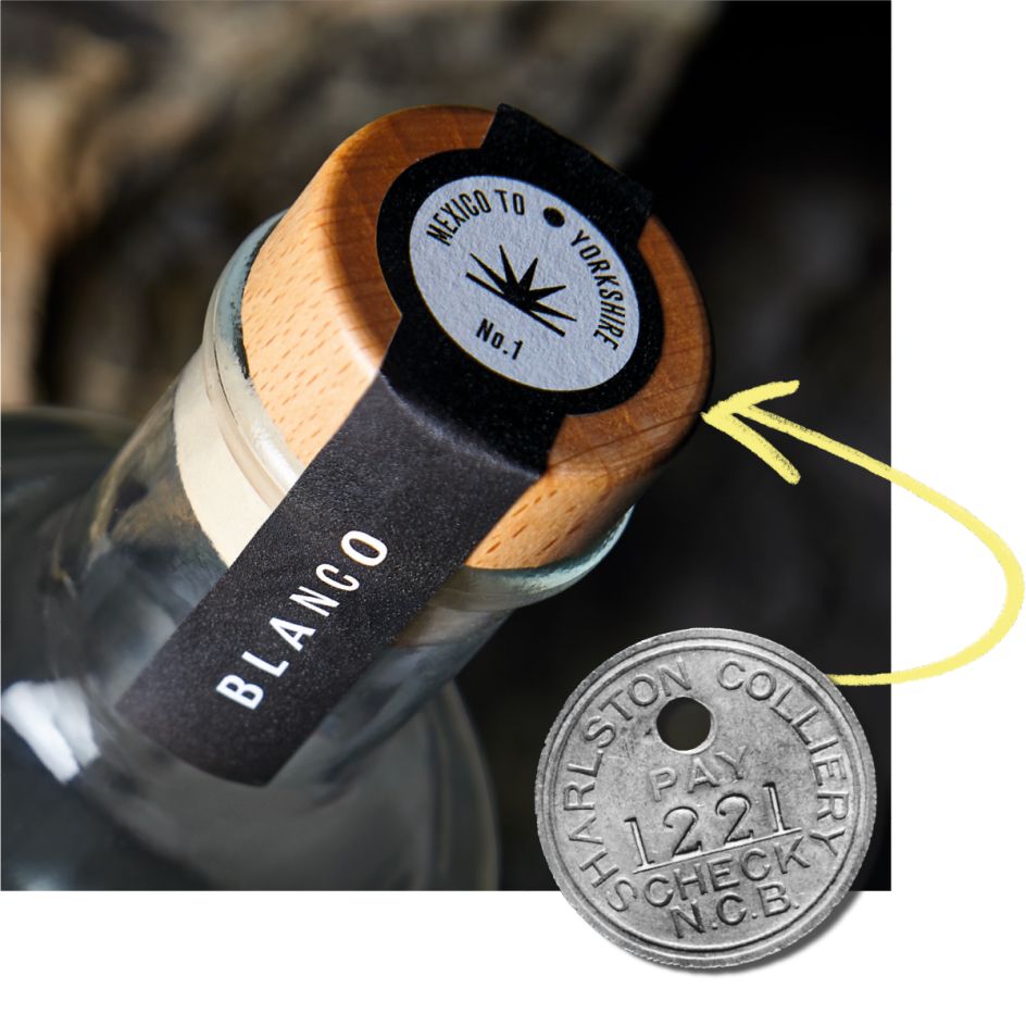
The name Pico is a direct nod to Mickaxe's Mexican language, linking the deep roots of mining heritage in both regions. The theme is in a package that symbolizes layered illustrations that represent geological hierarchies that visually link the mining history of Mexico and Yorkshire.
Our creative design director Joe Wallis explains, “The black and white images of the miners' archives represent the historical connections of the products alongside bright modern colour layers that reflect the vibrancy of Mexican street culture.”


The studio also used paper stocks of textures to evoke Yorkshire coal mines, raising gloss varnish on blue Webers to create contrast, enhancing the brand's narrative and celebrating both the depth and vibrant energy of modern Mexican culture.
Beyond impressive visuals, the Pico Tequilana packaging is a tactile experience. The label's die-cut design subtly mimics the rock formations and reinforces the idea of digging into layers of history. Tampering stickers, meanwhile, are inspired by the mining of “pit checks” used by miners to enter and exit the underground.
“The label itself is very tactile,” Wallis says. * “You can feel the layers while rubbing your fingers against the bottle. Every archive's black and white images have a very heavy texture, but modern, vibrant, colorful things are treated with heavy shiny varnish.”
The balance between modernity and authenticity is key to Picotekirana's positioning. They don't want to become carbon copies of traditional tequila brands, but instead embrace their own story, location and craft.
Since its launch, Pico Tequilana has been making waves. Bold colours and layered designs ensure high visibility in bar shelves and dimly lit venues, but strong brand storytelling resonates with consumers seeking authenticity and innovation.
“Our briefs were very open and perhaps challenging at first, but from day one, the proposition met head-on in a very positive way,” said Jody Monteith, sales director at Double Six Drinks. “Our brand vision was fully accepted and fostered gently. We are now delighted with the reality that lies in the 'Pico' tequilana.
By challenging expectations about what Tequila-Adjacent Spirit looks like, our creative has successfully created a brand identity that is more than just telling a story. It invites people to experience it. And in a saturated spirit market, that's exactly what it takes to stand out.